Wednesday 25 April 2018

Minor hack

So I have a few filofaxes and I like the notebooks mostly for the paper.  They come with a cardboard protector.  I have binned a few of these until recently when I was looking for a second pen holder for my flex.  I bought a Leuchturm 1917 Copper pen loop and put it onto the card and trimmed the paper just a little with a paper trimmer (Lidl's finest) and if you look at the photo left you can see a standard A5 cardboard page from a A5 notebook underneath et voila, a pen holder.  I could laminate it, I suppose but right now it's working.

Then I watched a YouTube video with Land of Jane N Rocco talking about pretty planners and I saw she had a hack for bigger pens, use a binder clip and space it to allow the pen clip go in.  The pen in the picture is too wide for the loop but the binder clip does a perfect job.  I'm not sure I'd leave it on the cardboard because I'm sure it would age it faster but it's a clever hack.  I'm sure it's known elsewhere but I've never seen it before.  Smart idea.

Monday 23 April 2018

Two shopping trips to Pen Corner


All products purchased by me with no promise of review or anything to any parties involved 

I had two trips to The Pen Corner in the last two weeks, the first week I bought the Faber Castell pen, which came with a free package of cartridges, and I also got some of the Lamy Bright Pink ink, which isn't me, at all, in a big way, I'm very not a pink person.  I'm a maroon or deep pink person but not a bright pink person, I wanted to try the ink to see if there was a green undertone, I like colourchanging things.  I put it in my Lamy AL-Star that's a deep pink, I will use up the cartridge, I've already given the second awr ro a friend.  If my pink-fond workmate was a fountain pen user I'd give the last four cartridges to her, I'll find a home for them some day.  The Rhodia is for testing pens.I also picked up a couple of international standard converters.
I only really intended to buy some Caroube de Chypre but I discovered a problem with buying this ink... there's nothing on the package to say what it is, just these two logos on the bottle and a general shade of grey and brown on the packaging, and they were sealed with plastic wrapping.  The staff member didn't seem to be very sure himself, so I bought both, although it does turn out that I have the Stormy Grey already.  Ah well, I do like it.  Must add the latest amethyst to my wish list)  Behind it is the sample pages I use, they're a printed template laser printed onto relatively cheap watercolour paper.  They work quite well and I like them.  However where I bought them hasn't had the A5 for a while.


Now for some testing   The Lamy Al-Star with what's pretending to be a medium nib, it's quite a fine medium and the aforementioned Bright Pink Ink.  Also the Faber-Castel Loom (I think) with grey ink.  The quotes are from The Wisdom of the Pagan Philosophers because it was on a shelf near where I sit.I like this grey. I also like this pen but unfortunately it doesn't post comfortably for me and that's how caps go missing in my house.

The next thing I need to do is add it all to my Everyday Carry log that I found via Figboot on Youtube

Saturday 21 April 2018

Current Carry and in use

 All products in this are bought with my own money and no money or goods have been received or promised for this post.


 This is what I'm currently carrying almost every day.  The Blue Filofax Pennybridge underneath is my Wallet.  They both have a fold out full year spread (not liking the 2018 one, it's on a single side and is a bit unwieldy but it keeps my working days straight for the year and major events.  I love the fact that the pen case can take the smallest filofax notebook, which means that this is what I regard as an essential carry.  There's always a fine fountain pen and a medium, I also often have a ballpoint or mechanical pencil in here. The pocket filofax has a diary where I keep what my worked hours, major notes to self and what I have on loan from the library list.
The Filofax Flex's contents are below. Two A5 notebooks fit in, one for my thoughts diary and the other for writing.  The Bloggers Journal is probably going to start being left at home soon but in it I record what I'm thinking of doing for this blog, I'll probably create a page in my creative writing notebook and use it and then transfer it in later in the day.  In work I have an A5 notebook that I use as a Bullet Journal and as it has only been in use a month will see more changes before I settle the style.


These are the two notebooks the left hand one is from TK Maxx it came as a three pack and have quite nice paper that is pretty fountain pen friendly.  The Paper-oh on the right is from Easons and only really accepts Japanese Fine nibs


These two are my current use notebooks, the blue on the top has TV series I'm following and the Paperchase is my pen and ink log and I'm sure it will feature a few times, these are both A5..

Thursday 19 April 2018

Inxperiment

Materials: Ink from Appelboom's Inxperiment which I have signed up to with my own cash, Water brush from The Range, Business Card from Vistaprint many years ago, background notepad from Tesco. No company has asked me for any endorsement, though Appelboom have a competition associated with painting their postcard.


It came in an envelope nicely packaged with five vials of ink and a postcard


I tested each colour on the back of some old business cards of mine (that need updating, one of the email addresses is defunct)


And the finished product, I only used the colours provided for this and had a lot of fun doing it.


I used this water brush from the Range (who have a branch in Liffey Valley in Dublin) I was curious to try them, I liked how it gave me some shading and colour depth.


Sunday 15 April 2018

Pen Cleaning

Materials: all materials were purchased by me with no expectation of reward. Sources include Pure Pens (brown Noodler's Creeper and syringe); a pharmacy somewhere for the bulb; La Estilográfica Moderna in Zaragoza for the black pen with the turquoise highlights (an IXC Barcelona pen) and if I recall correctly the Pen Corner on Dame Street for the Silver pen (I've had it for years).  In this post I receive no financial return for any of the links.
 
 see also: Goulet Pen's Fountain Pen 101 Pen Cleaning and Levenger's Pen Cleaning guide

Most places suggest using filtered water, I have a filtered water tap, you could also reduce the material in the water by using cold previously boiled water (perfect excuse to make a cup of tea and a nice sit down for a while before doing this).  Hot or very warm water is not recommended as that might warp the materials, so room temperature is best.

Now I probably don't do this as often as I should with some cheaper pens but it's a good habit to get into when you change inks because some brands of ink could react with others. I've never had this but knowing my luck it would happen with some of my favourites!  Also if you leave pens inked up they can dry up (and the ink can evaporate anyway which is a waste); many sites suggest only inking up enough for a few days or weeks. Not that that stops a lot of people and it shouldn't stop you, just be aware that if it gets really bad you will have to resort to special pen flushes aka solvents. Don't use random solvents as it might destroy your pen.  Another reason to wash pens is because small fibres from paper which can cause pens to work sub-optimally.


Pens ready to go with water in two of the containers, a piece of kitchen paper in the third, the fourth is just to hold the blunt syringe and bulb syringe.  I use this configuration when I'm cleaning several pens, which is my usual pattern, I'm lazy and tend to do pens in a bunch rather than do them singly.

First step: dismantle pens, except the Noodler, it's brand new I'm just rinsing it out as recommended by many sites.  But it's a piston fill, so it's basically twist the piston to open


You can see the cartridges, these are what are referred to as International Standard Cartridges and I don't normally clean them as I have a lot of them.


Pushing the bulb syringe to flush, you really want to push it in as far as possible.  Otherwise you will get overspill of ink.You can add a drop of washing up liquid to the mix, this is often useful for first flushes to ensure any residual oils from the making process are removed, but also flush with plain water a few times after this.

 Pen 1 in to soak, to make sure I've flushed it enough there shouldn't be any sign of ink in the water while flushing the second pen.  Don't forget to flush out the lids,
 If you don't want ink all over your fingers you need to wear gloves to do this, I'm pretty careful with all this and I still regularly get ink everywhere
 Clean cartridge versus dirty one.
Putting everything in to drain, including the lids.  I left them for a few days before taking them out.  There's a lot of pens I have inked at the moment so I'm trying to use more of the variety.


April Splash

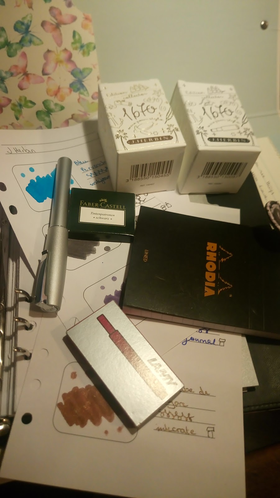
Materials: All materials purchased with no sponsorship or expectation of reward. Tesco flowers and Butterflies notepad bought by me; ink and pens all purchased by me from various sources; 
Manuscript pen used in my own journal from Powells of Galway and Notebook purchased in T K Maxx.

I'm not going to pretend this is perfect calligraphy, I'm quite rusty at lettering but this is more about spacing and setting out a page than the lettering itself.  I did calligraphy as part of Art to my Leaving Certificate. I was the only person who did calligraphy to the Leaving Cert that year.  You were given so many lines from a poem on your English course that year, mine was a section of The Fisherman by William Butler Yeats.


This is me playing with the poem "Song" or April.  I'm kinda cheating here as I've already lettered this a few times and already did it for my work blog so I know what the lettering is going to be like somewhat.  I like how it worked out there so I'm repeating it into my general diary.  You can see me play with various letters and spacing.

This is me working more properly with it.

First off, listing all the capitals and seeing where I want to go with them.  The first page was done yesterday but the idea for the A came to me last night and I like it, funnily it only really works when I write left-handed.  I am left-dominant but I learned how to do calligraphy with both hands, I have found that my own handwriting doesn't impinge on the regularity of the lettering when I write with my right.

Then I work out the longest line, somewhat of a tie between line 2, "Laugh thy girlish tears" and the later line "Laugh thy golden tears" depending on how you write your os.  However if you look at it you can see that it would be best if it was written near the edge of the page and the earlier line written afterwards and spaced in a little..I may make the first April a little bigger.  With truly formal calligraphy I'd now centre the longest line on the page and base the margins of the page on this spacing, but this is not formal calligraphy by any manner or means.

Next you need to work out if the poem will fit on the page you have, I'm pretty sure about this one, but what you want to check is that you bias the empty space towards the bottom of the page. You shouldn't have equal spacing above and below because the eye sees the lower space as less.  My art teacher always said 2/3 bottom and 1/3 top.  But a reasonable bias works In this case I have 12 lines of poem plus title and author, which I could put either end of the same line but I plan to leave a line of a gap.  My page is 23 lines long.  If I start line two at about line 5 things should be fairly well spaced. 

The Version from my work  notebook. The Second April, April is a bit messed up as I glossed over the lines and started letting the next line, I just used correction tape to cover it up but the standard fountain pen ink didn't write well on it.  Oops.  I can't remember which of my standard pens I was using, it's a medium width with enough flex to get a bit of variation.

The version in my own notebook, and I forgot things, but it's a good example of what can and will go wrong.  The lettering I'm happy with overall but it would have suited larger spacing, not the double spacing but probably space and a half.  I started writing, with the Manuscript calligraphy pen and the ink that came with it, I used another pen to put the poets name in.  It gives the visual balance I was looking for. I wouldn't have got the whole poem in at that spacing so after the first four lines I reverted to single spacing.  Looking at it if I was to do it again I would have gone for the double spacing for after the title and then possibly for the next line and then revert to single spacing.

Two different versions of the same poem, quite similar lettering, slightly different results.


Inky Links

Ink Swatches Visiting pilot pens https://blog.wonderpens.ca/visiting-pilot-pens-fountain-pen-factory-in-hiratsuka/